Next: Tables
Up: Mechanical Engineering Style Manual
Previous: Figures
Contents
Graphs
The American Standards Association [11] outlines the do's
and don'ts of making engineering graphs. Their thirteen rules for
making graphs are presented here.
- The graph should be designed to require minimum effort from
the reader in understanding and interpreting the information
it conveys.
- The axes should have clear labels that name the quantity
plotted, its units, and its symbol if one is in use.
- Axes should be clearly numbered and should have tick marks
for significant numerical divisions. Typically, ticks should
appear in increments of 1, 2, or 5 units of measurement multiplied
or divided by factors of ten (1, 10, 100, ...). Not every tick
needs to be numbered; in fact, using too many numbers will just
clutter the axes. Tick marks should be directed toward the
interior of the figure.
- Use scientific notation to avoid placing too many digits on
the graph. For example, use
 rather than 50,000. A
particular power of ten need appear only once along each axis;
avoid confusing labels such as ``Pressure, Pa x 10
rather than 50,000. A
particular power of ten need appear only once along each axis;
avoid confusing labels such as ``Pressure, Pa x 10 ''.
''.
- When plotting on semilog or full-log coordinates, use real
logarithmic axes; do not plot the logarithm itself (e.g., plot 50,
not 1.70). Logarithmic scales should have tick marks at powers of
ten and intermediate values, such as 10, 20, 50, 100, 200, ...
- The axes should usually include zero; if you wish to focus on
a smaller range of data, include zero and break the axis.
- The choice of scales and proportions should be commensurate
with the relative importance of the variations shown in the
results. If variations by increments of ten are significant, the
graph should not be scaled to emphasize variations by increments of
one.
- Use symbols such as
 ,
,
 and
and  for data points. Do not use dots (
 ) for data. Open symbols
should be used before filled symbols. You may place a legend
defining symbols on the graph (if space permits) or in the figure
caption.
) for data. Open symbols
should be used before filled symbols. You may place a legend
defining symbols on the graph (if space permits) or in the figure
caption.
- Place error bars on data points to indicate the estimated
uncertainty of the measurement or else use symbols that are the
same size as the range of uncertainty.
- When several curves are plotted on one graph, different lines
(solid, dashed, dash-dot, ...) should be used for each if the
curves are closely spaced. The graph should include labels or a
legend identifying each curve. Avoid using colors to differentiate
curves, since colors are usually lost when the graph is
photocopied. Theoretical curves should be plotted as lines
without showing calculated points. Curves fitted to data do not
need to pass through every measurement like a dot-to-dot cartoon;
however, if a data point lies far from the fitted curve, a
discrepancy may be indicated.
- Lettering on the graph should be held to the minimum
necessary for clarity. Too much text (or too much data) creates
crowding and confusion.
- Labels on the axes and curves should be oriented to be read
from the bottom or from the right. Avoid forcing the reader to
rotate the figure in order to read it.
- The graph should have a descriptive but concise title. The
title should appear as a caption to the figure rather than on the
graph itself.
Science and engineering practice follows all of these rules except for
a minor deviation of rule #3. Recommended practice by most
engineering publications is to place the tick marks outside the
graph. Also it is sometimes useful to number the scale in different
increments than suggested in rule #3; angular degrees are best labeled
30, 60, 90, ..., inches in increments of six to easily convert to
feet. Another exception is to rule #5. Decibels and earthquake
strength expressed using the Richter scale should be represented using
a linear scale as these units are already exponential. One final
derrogation is that the Système International has prefixes. Use
them![[*]](footnote.png) .
.
Proper graphs indicate the origin of both axes. Only by showing the
zero can the importance of a trend be compared to an invariable part of
the function. Trends that have large y-axis intercepts and small
slopes are best represented by a constant and not a line. However, most computer
graphing packages do not allow a break in the scale to permit the
indication of the zeros of the axes.
If you are using a computer graphing package, make sure that you are
plotting engineering graphs. Some packages, such as Quattro
Pro
 or Excel
, have graph options that are
not suitable for engineering graphs such as the x-y line graph. Do
not use these options to plot your graph, since the x-axis scale will
be irregular and the graph will be useless. A good way to be alerted
to an irregular axis is to watch for oddly numbered ticks (e.g., 49.21,
37.17, 55.43) at equal spacing along the x-axis. These graphs may be
useful in the financial world, but they are unacceptable in science and
engineering.
or Excel
, have graph options that are
not suitable for engineering graphs such as the x-y line graph. Do
not use these options to plot your graph, since the x-axis scale will
be irregular and the graph will be useless. A good way to be alerted
to an irregular axis is to watch for oddly numbered ticks (e.g., 49.21,
37.17, 55.43) at equal spacing along the x-axis. These graphs may be
useful in the financial world, but they are unacceptable in science and
engineering.
In general, be careful with line graphs. Do not play connect-the-dots
with your data points (rule #10). In most cases, a graph should show a continuous
trend even though your experimental data show scatter about the trend.
One line type that should be avoided is Excel
's
smoothed line. The line is forced (by using a spline) through the data
points showing slopes that depend only on the uncertainties of each
point. This is not a true trend line as it does not take into account
the erroneous nature of the data point without error bars. Always
qualify a trend line: fitted by eye, curve fit using least
squares, etc. Never extend a trend line (extrapolate) beyond the error
margins of the maximum and minimum data.
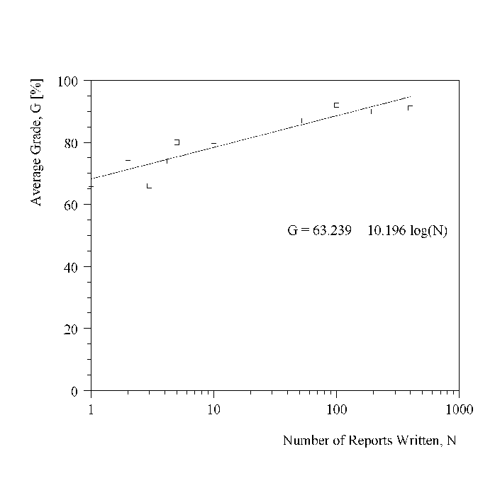
Figure 7.1:
A Good Graph of How Writing Experience Affects Students'
Grades
|
|
Two examples are given below; Figure 7.1 shows how the average grade
assigned to written reports improves with the number of reports written
by university students (fictitious data). The graph has a reasonable
trend line fitted to the data, illustrating that the average grade
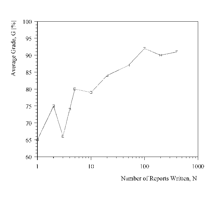
increases with the number of reports written. Figure 7.2 shows the same
data with a connect-the-dots plot. This accentuates discrepancies in
the trend which are really due to inadequate sampling or scatter in the
data. Avoid plots like the latter.
Figure 7.2:
A Poor Graph of How Writing Experience Affects Students'
Grades
|
|
Next: Tables
Up: Mechanical Engineering Style Manual
Previous: Figures
Contents
Marc LaViolette
2006-01-13